

Color is one of the simplest ways to completely change how a home looks and feels. You may have beautiful furniture, expensive lighting, and carefully selected décor, but the wrong wall color can make everything feel disconnected. The right colors, on the other hand, bring all those elements together and give every room its own personality.
Today’s interiors are moving away from cold, impersonal spaces. Homeowners are embracing warmer neutrals, earthy greens, sophisticated browns, muted blues, and expressive accent shades. The best Interior Paint Colors are not simply the shades receiving the most attention online. They are colors that suit your home’s light, furniture, architecture, and the atmosphere you want to create. Whether you love modern minimalism, rustic warmth, classic elegance, or colorful contemporary spaces, there is an inspiring palette waiting for you.
Home Interior Colors: Expert Tips for a Beautiful Living Space
Endless discussions, lots of catalogs, several visits, suggestions from everyone around you and hours of browsing – sounds like you are planning your child’s higher education, doesn’t it? Not exactly. We’re talking about choosing the perfect interior home colors. Where you’ll experience your day-to-day life, celebrate the milestones, and make memories with the people you love. You want each room to be just so, of course. That’s where this guide comes in.You’ll find the best home interior color ideas, timeless color combinations, and practical tips to help you create beautiful, balanced spaces that reflect your style and make every room feel welcoming.
Why Interior Colors Matter More Than You Think
The color of a room affects much more than the look. It influences the perception of the area as big, bright, pleasant, soothing, lively or intimate Light colors usually help small rooms feel less closed in. They reflect more light. Darker colors can add clarity and make vast spaces feel cozier. Warm hues bring vitality and sensuality, while cooler colors produce a gentler, more relaxed atmosphere.
Your color choices will also affect how furniture and ornamental objects are seen. A walnut table against creamy beige walls might seem luxurious, against deep green, striking. White furniture looks clean against faint blue, but softer and more natural next to warm taupe. This is exactly why you need to plan out your color scheme carefully before you buy dozens of decorative accessories. First setting the background gives everything else a visual direction.
Trending Home Interior Colors Bringing Warmth Back
One of the most powerful motifs in Trending Home Interior Colors is the return of warmth. Stark white and frigid gray aren’t the standard answer anymore in terms of modern interiors. Key foundations are becoming warmer neutrals, earthy mid-tones, greens, browns and elegant natural colors.
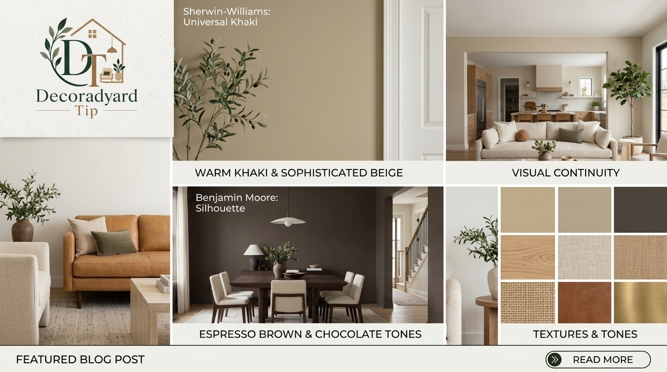
Sherwin-Williams’ 2026 Universal Khaki is a warm, anchoring neutral that is based on simplicity and timeless style. Benjamin Moore’s Silhouette mixes espresso brown with charcoal undertones, while current design coverage is also showing mushroom, greige, taupe, cognac and olive as warmer choices than sterile white walls.
These colors work because they feel comfy but don’t seem dated. They have enough character to make an interior interesting, yet are adaptable enough to live with for years.
Warm Khaki and Sophisticated Beige
Beige has changed. Instead of the flat yellow-beige that dominated older homes, modern versions have more sophisticated undertones. Think sandy beige, warm stone, light mushroom, oatmeal, camel, and khaki.
These shades work beautifully with natural oak, walnut, linen, jute, leather, brushed brass, black metal, and cream upholstery. They are especially useful in open-plan homes because they create visual continuity without making every area look identical. If pure white feels too clinical but you still want brightness, warm beige is one of the safest Wall Color Ideas to explore.
Espresso Brown and Chocolate Tones
Brown is coming back into fashion but this time it is deeper and more sophisticated. Deep espresso, cocoa, coffee, chocolate and umber can make an interior feel opulent. You don’t have to paint every wall dark brown. Try it behind a bed, a fireplace, in built-in storage, in a dining room or on cabinets. Pair dark brown with cream, warm white, camel leather, muted green, brass and natural timber for a chic layered design.
Warm Interior Colors for Comfortable Everyday Living
People want their houses to feel inviting, and warm interior colors remain popular for a reason. Warm interior color is not necessarily a blazing red or orange. It has nuanced hues with warm undertones, such terracotta, caramel, peach-beige, clay, dusty rose, warm cream, tobacco brown, and muted mustard.
For conversation and leisure rooms, a warm palette is very effective. Colors that bring a feeling of comfort are helpful in living rooms, dining areas, family rooms, bedrooms, and reading niches. The secret is self-mastery. Instead of blending five strong warm colors, choose one strong warm neutral and add on one or two deeper accents like cushions, rugs, artwork, curtains, or occasional furniture.
Nature-Inspired Greens Continue to Feel Fresh
Green has gone from an accent option to a modern interior workhorse. Sage is the perfect choice for comfortable kitchens and bedrooms. Olive brings maturity to traditional or mid-century interiors. Eucalyptus gives modern homes a delicate organic feel, while richer forest and jade tones are great for dramatic feature walls. Pair greens with cream, tan, wood, stone, brass, woven textiles and indoor plants. These pairings feel harmonious because they mimic color combinations already present in nature.
Creative Living Room Colours That Feel Stylish and Welcoming
Your living room typically has multiple duties. It may be the place where you watch TV, entertain guests, do a little work, relax with family or have peaceful evenings. For that reason, Living Room Colors must be balanced.
If you’re after versatility, go with warm greige, mushroom, soft khaki, creamy white, subtle sage and dusty blue. They were great mood setters without limiting how you rearrange your furnishings later. For something a little more dramatic, try olive green, smoky jade, espresso brown, deep navy, muted burgundy or charcoal. Use darker tones where natural light is plentiful or you deliberately want a cocooning effect. One good idea is to make the main walls pretty flexible and to let one architectural feature be the home for brighter color. A center of attention could be a wall with a fireplace, bookcase, alcove, media unit or paneled wall.
Muted Blues for Calm, Timeless Interiors
Blue is one of the most flexible interior families but today’s rooms tend to utilize softer, more nuanced variants rather than vivid primary blue. Dusty blue, slate blue, smoky teal, blue-gray, muted navy and blue-green tints produce calm environments without sacrificing character. They are perfect for bedrooms, home offices, reading rooms, baths and living spaces with good natural light.
Combine warm white and light oak with subdued blue for a contemporary combination. Navy or slate with walnut, brass, cream and brown leather will provide a more sophisticated environment. The pairing of warm materials with cool blue keeps the area from seeming too cool or too earthy.
Terracotta, Clay, and Earthy Reds Add Personality
Homeowners who want more vitality but not too bright a color might consider terracotta and earthy red. Clay, cinnamon, red, burned orange, subdued brick, paprika and dusty coral all look well with the current trend for natural materials and hand-crafted interiors.
These colors are great for Mediterranean, boho, rustic, Southwest, eclectic and warm contemporary Interior Styles. You don’t have to paint a whole room terracotta; you may introduce the color with one wall, ceramic décor, cushions, carpets, artwork or painted cabinets. Terracotta feels warm and handcrafted against milky walls and wood. Add olive green or deep brown and the palette gets even richer.
Build an Interior Color Palette Instead of Choosing One Shade
It’s unusual that professional looking interiors are based on a single paint color. They employ a harmonized palette of Interior Colors. A sensible technique is to choose three key color roles: a dominant, a supporting and an accent. For instance, begin with warm cream for most walls. Use sage green for your cabinets or furniture. Add walnut, terracotta or brass touches to finish.
Another palette could incorporate mushroom beige walls, chocolate furniture, ivory fabrics, mild olive accessories and black accents. It is not mathematics in the rigid sense. It is a visual hierarchy. Let one hue obviously dominate, with the others supporting it. Busy room when colors vie for attention. A bright space can feel serene when the palette has a defined structure.
Interior Styles and the Colors That Work Best
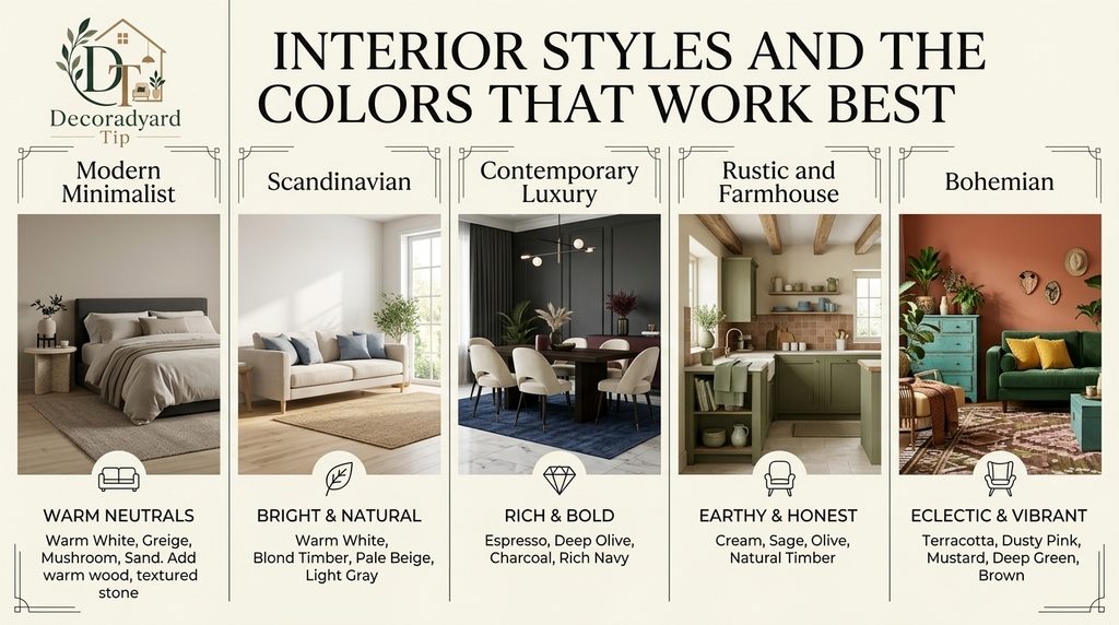
Different Interior Styles naturally respond to different color families. Matching your colors to the overall design direction makes decorating much easier.
Modern Minimalist
Use warm white, soft greige, mushroom, sand, taupe, charcoal, and restrained black. Introduce warmth with light wood, linen, textured stone, and ceramics. Modern minimalism feels more inviting when neutrals have subtle warmth rather than appearing completely gray.
Scandinavian
Start with warm white, pale beige, light gray, muted blue, or soft sage. Add blond timber, woven textures, simple black accents, and plenty of natural light. The goal is brightness without sterility.
Contemporary Luxury
Try espresso, deep olive, charcoal, creamy ivory, warm taupe, muted burgundy, and rich navy. Combine these shades with marble, dark wood, glass, metal, velvet, and carefully controlled lighting.
Rustic and Farmhouse
Cream, warm white, sage, olive, clay, beige, muted brown, and dusty blue create a natural farmhouse environment. Natural timber should remain an important part of the palette rather than being hidden beneath too much paint.
Bohemian
Bohemian interiors provide more freedom. Terracotta, mustard, olive, dusty pink, turquoise, cream, brown, and deep green can work together when they are repeated through rugs, artwork, textiles, plants, and handcrafted décor.
Wall Color Ideas for Small Rooms
Your small spaces don’t need to have white walls as a default. A pale mushroom, warm off-white, light sage, sandy beige or dusty blue can make a compact room feel more sophisticated without significantly shrinking its impression of space.
Another smart choice is color drenching: painting the walls, trim, and occasionally even the ceiling in matching shades. Strong visual borders in a tiny room might cut the space into different surfaces, rather than giving it a continuous feeling. If the room doesn’t get much daylight, don’t think dazzling white will save the day. Poor light can make white look dreary or gray. A warmer mid-tone might result in a much more deliberate result.
Use Dark Colors Without Making Your Home Feel Heavy
Dark Interior Paint Colors may make some of the most memorable rooms when used properly. The trick is equilibrium. If you’re opting for deep green walls, incorporate white upholstery, shiny surfaces, soft lighting and lighter artwork. If you go for espresso brown, counter balance with natural linen, pale carpets, warm metals or light timber.
Dark shades are especially good in dining rooms, bedrooms, libraries, media rooms, powder rooms and areas where you want a sense of intimacy. You can also selectively employ deep color. Rather than painting every wall, consider painting inside doors, cabinets, bookshelves, window frames, islands or architectural elements.
How Home Lighting Changes Interior Paint Colors
Don’t ever choose paint from a computer image. The time of day, how much natural daylight is coming in, the artificial lighting, the floor, the furniture, which way the windows face, the colors of the walls around it. All of those things can make a shade look radically different. A beige with a touch of green can be neutral in a showroom but read distinctly green next to your flooring. The warm cream might look yellow under some lights and the deep blue can look practically black after sunset.
Always test samples in the room itself. See them in the morning, afternoon and evening. Look for shade around floors, cupboards, curtains and large pieces of furniture. The paint producers advise sampling or visualizing the colors because digital representations do not quite replicate the actual appearance of paint.
Connect Color With Materials and Texture
Colors alone don’t make beautiful rooms. Imagine two rooms, painted exactly the same shade of beige. There is no texture. Just plain plastic furniture. The second marries oak, linen, boucle, stone, handcrafted ceramics, wool and aged brass. The wall color is the same, but the second space feels richer.
Color is improved by texture. Warm neutral walls are fascinating with rough wood and woven textiles. Stone and timber look more natural with green. Chocolate brown is luscious against velvet and brass. When selecting your Interior Color Palette, consider materials and finishes, as well as paint.
Let Personality Lead the Trend
Trends should inspire your home, not control it.
Clearly, the latest color predictions are embracing warming neutrals, nature-inspired greens, richer browns and more expressive colors. But a stylish color is only successful when you truly love living with it. If you love blue, then be blue. If terracotta makes you feel better than a trendy beige, choose terracotta. A house should feel like the people who live there live there, not like a temporary showroom. Some of the best interiors are a mix of timelessness and a few personal, expressive choices.
Home Interior Color: Decoradyard Tip
At Decoradyard Tip we think that the appropriate colors can drastically change the look and feel of your house. From the latest Home Interior Color ideas to trendy Kitchen Interior Design and inspiration from a contemporary False Ceiling Design we aspire to provide you with practical tips, creative ideas and easy to follow guides to create beautiful and comfortable living spaces. Along with home décor inspiration, we also offer expert Guest Posting and Content Writing services for businesses, bloggers and brands looking for creative, SEO-friendly content that boosts online visibility, engages readers and develops lasting authority.
Learn more about our mission and the team that produces our material on our About Us page. If you have any queries, partnership opportunities, or would want to discuss our Guest Posting or Content Writing services, please visit our Contact Us page. Decoradyard Tip is dedicated to helping you create beautiful and functional homes with expert interior design tips and entertaining home renovation ideas.
Final Thoughts
Today’s most desirable homes are becoming warmer, richer and more personalized. Flexible foundations include creamy neutrals and khaki. Mushroom and taupe add subtle depth. Sage, eucalyptus, olive and smoky jade link rooms to nature. Espresso and chocolate are sophisticated, while expressive tints such as clay, terracotta and subtle blue give flair.
Whatever route you select, develop a balanced Interior Color Palette instead of decorating around unrelated hues. Test paint in your actual lighting, coordinate with furniture and materials and let your favorite Interior Styles inspire the final pairing. Good interior design isn’t about stuffing every area with the latest trend. It’s about being thoughtful with color so that your home is lovely when you first walk in and comfortable long after the trend has changed.
FAQs
What are the greatest home interior colors for modern homes?
Popular picks are white, beige, greige, warm gray, sage green, gentle blue and earth tones . They are classic, graceful colors that work with a range of interiors.
How often should I change the colors of my home interior?
Most homeowners will change interior colors every 5-10 years or when they are remodeling, upgrading furnishings or changing the general design style of their home.
Should all the rooms be painted the same color?
Not necessarily. A similar color palette throughout the house promotes flow, but each room can still have its own shade or accent color to suit its purpose and atmosphere.